
Color is a powerful element in interior design, capable
of setting the mood, expressing personal style, and transforming spaces. When
it comes to selecting tiles for your project, Granada Tile offers a captivating
color palette that will elevate your space to new heights. Dive into the world
of colors and discover how to choose the perfect Granada Tile for your project.
The Artistry of Granada Tile’s Color Selection
Granada Tile takes immense pride in their extensive color palette, which reflects their dedication to craftsmanship and
design. Each color has been carefully curated to evoke specific emotions and
complement various aesthetics. From vibrant hues that energize a room to
soothing neutrals that create a sense of calm, Granada Tile offers a wide range
of options to suit every taste and design vision.
Understanding Color Psychology
Color psychology plays a vital role in creating a desired atmosphere within a space. Explore the impact of different colors and how they can influence mood and perception. By understanding color psychology, you can make informed choices that align with the desired ambiance of your project.
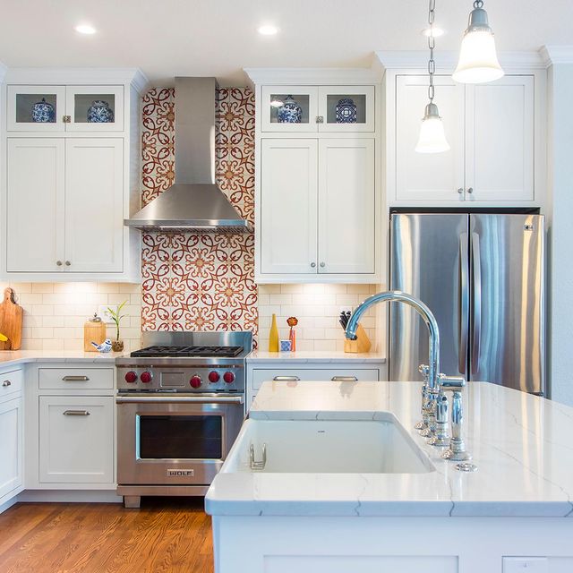
Color psychology is the study of how colors can influence human emotions, behaviors, and perceptions. It reflects the psychological and emotional responses that different colors evoke, making it a valuable tool in interior design and choosing the right Granada Tile for your project. Warm colors such as red, orange, and yellow are known to evoke feelings of energy, warmth, and excitement. They have a stimulating effect and can create a sense of passion, enthusiasm, and optimism. Incorporating warm-colored Granada Tiles into a space can make it feel vibrant, dynamic, and inviting. These colors are often used in areas where socialization and activity are encouraged, such as dining areas, kitchens, or entertainment spaces. Check out the Olvera collection for warm colored inspirations.
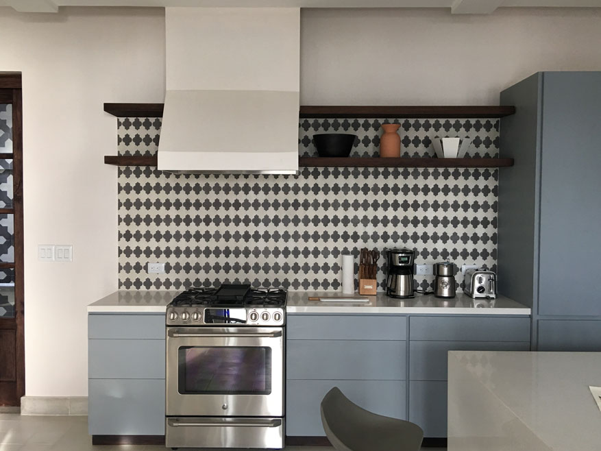
- Cool colors such as blue, green, and purple have a calming and soothing effect. They can promote relaxation, tranquility, and a sense of balance. Cool-colored Granada Tiles can be used in spaces where a peaceful and serene atmosphere is desired, such as bedrooms, bathrooms, or meditation areas. These colors can visually expand a space, making it feel more spacious and tranquil.
- Neutral colors like white, gray, and beige are versatile and timeless. They create a sense of simplicity, elegance, and sophistication. Neutral-colored Granada Tiles can serve as a versatile foundation for any design style, allowing other elements in the space to stand out. Neutrals are often used to create a minimalist aesthetic or to provide a backdrop for bolder accent colors.
- Bold and vibrant colors like magenta, turquoise, and lime green can create a sense of excitement, energy, and individuality. These colors make a statement and can be used to create focal points or draw attention to specific areas within a space. Incorporating bold-colored Granada Tiles can add drama and personality, infusing a space with a dynamic and vibrant atmosphere
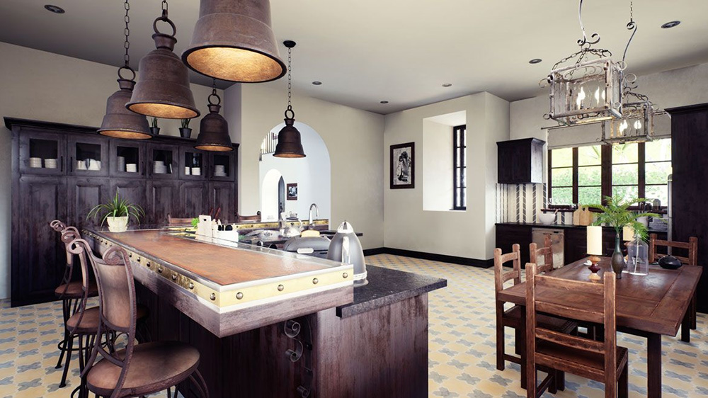
- Earthy and natural colors, such as browns, greens, and earth tones, are often associated with nature and the outdoors. These colors can create a sense of grounding, stability, and connection to the natural world. Using earthy-colored Granada Tiles can bring warmth and a sense of tranquility to a space, making it feel cozy and inviting.
It’s important to note that individual interpretations of color can vary
based on personal experiences, cultural influences, and personal preferences.
While color psychology provides a general understanding of the emotional and
psychological effects of different colors, it’s essential to consider
individual reactions and create a space that resonates with your own
preferences and intentions.
Harmonizing with Existing Elements
When selecting Granada
Tiles, it’s essential to consider the existing elements within your space. Take
into account the color of your walls, furniture, and other decorative elements
to ensure a harmonious and cohesive design. Whether you want tiles that complement
or contrast with these elements, Granada Tile’s color palette provides endless
possibilities for creating the desired visual impact.
Creating Contrast and Balance
Choosing colors that create contrast can add visual
interest and depth to your space. For instance, pairing a bold, vibrant tile
with a neutral backdrop can create a captivating focal point. Conversely, a
monochromatic color scheme can promote a sense of harmony and tranquility.
Explore different combinations and experiment with contrasting and
complementary colors to find the perfect balance for your project.
The Power of Accent Tiles
Accent tiles offer an opportunity to infuse a space with personality and creativity. Granada Tile’s Minis Collection color palette includes unique patterns and intricate designs that can be used as accent tiles to add a touch of drama or create visual focal points. Whether you incorporate them as a border, create a feature wall, or use them as a central design element, accent tiles allow you to make a bold statement and showcase your individual style.
Choosing the right color for your Granada Tile project is an exciting journey that allows you to express your style and create a space that is visually captivating and emotionally engaging. By exploring Granada Tile’s extensive color palette, understanding color psychology, and considering the existing elements in your space, you can select tiles that harmonize, contrast, and transform your project into a true work of art. Let the colors of Granada Tile inspire your creativity and bring your vision to life.


