A world without color is no world at all. Seasoned interior designers, burgeoning home decor enthusiasts, and consumers are all captivated by color choices. In both the home and business, your color choice makes the first impression with visitors. Color can create feelings of warmth, energy or passion. While some decisions remain timeless, modern color trends are about mixing it up a bit beyond the standard. Keeping up with what the experts are saying is crucial to anyone with an eye for design, and what they’re saying for 2019 is big news.
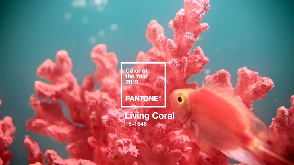
Cool heads prevail in the coming year. From HGTV to Elle Decor, we’re seeing experts lean towards a cool, calming approach to colors. Accent colors still loom large, as we see in HGTV’s top Pantone pick for 2019, ‘Living Coral,’ but the remainder of interior colors are on the blues, greens, and greys spectra. Serenity reigns supreme when it comes to Elle Decor’s choices for the new year, as they recommend misty blues, warm forest greens, and off-cream bases.
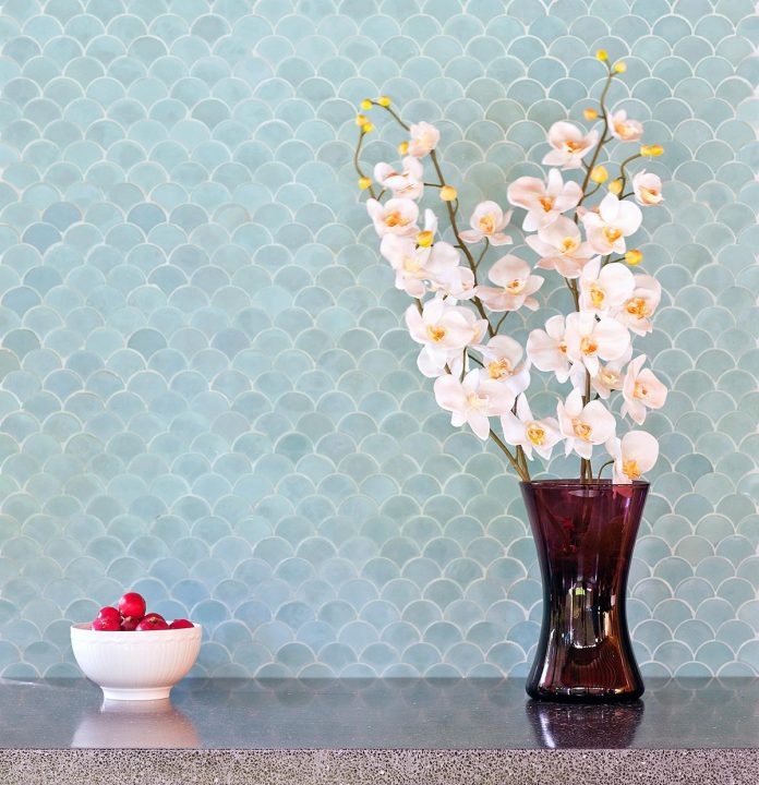
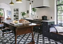
While the all-white home remains a popular and modern trend, we’re seeing experts recommend introducing color in unexpected ways. Accent walls have long remained a staple in interior decor, and they don’t plan on leaving soon, but flooring is finding sure footing in the market. Neutral homes introduce personality through the use of colored tile, patterns, and unique shapes offsetting more cookie-cutter interiors. One of the bright color trends of 2019 we’re seeing recommended across all the most popular magazines is aqua, which joins its cool-toned brethren with a vibrant but calming effect.

If cool tones don’t work with existing decor, take it warmer with 2019’s red recommendations: rust and deep berry reds. Rust is utilized as a universal color and is seen everywhere from tile backsplash to full room paints. Deep reds with purple hues are bolder and take careful planning, but can take a room from basic to head turning with the right use. Even a muted purple, listed on HGTV’s must-watch color list for 2019, can bring a room to life without seeming cartoonish or overbearing.
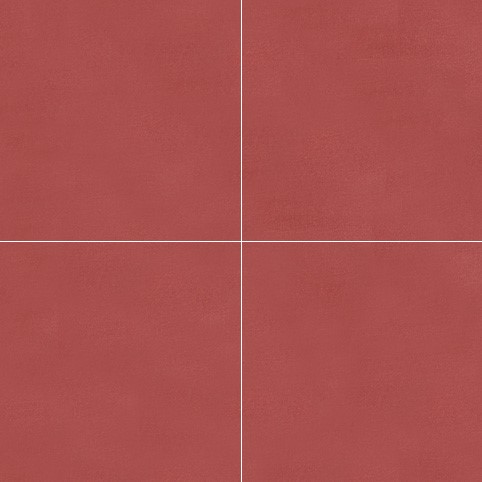
Regardless of color choice, utilizing it correctly is the key to execution. Whether you opt for the 2019 Pantone color, ‘Living Coral,’ or choose a relaxing light grey, you must use it to highlight your home’s features and not drown them out. One of the top ways we’ve seen this done is by keeping decor or cabinetry simple while incorporating a stunning, vibrant cement tile floor that uses patterns to offset a bold color. Backsplash in the kitchen or bathroom is an easy way to throw in some of the deep reds or navy that are highlighted for 2019. Color is what breathes life into a home – so take a deep breath and let your creativity shine.



Do you offer a tile in Pantone’s Living Coral color? If so, is the finish glossy or matte?
Hello Michael, we can do custom tile, please give us a call at (213) 788-4238.