For interior designers, very little makes a more significant impact than the creative use of stunning, colorful tiles. Creative use of color and pattern transforms a space from bland and simple to vivacious and welcoming. Architectural features are easily highlighted, and rooms shift from basic to conversation starters with only a few small tile design tweaks. Some top designers have weighed in on tips for creating a color palette for your tile designs, and we’re here to share them with you.
Tip #1 – Show your personality
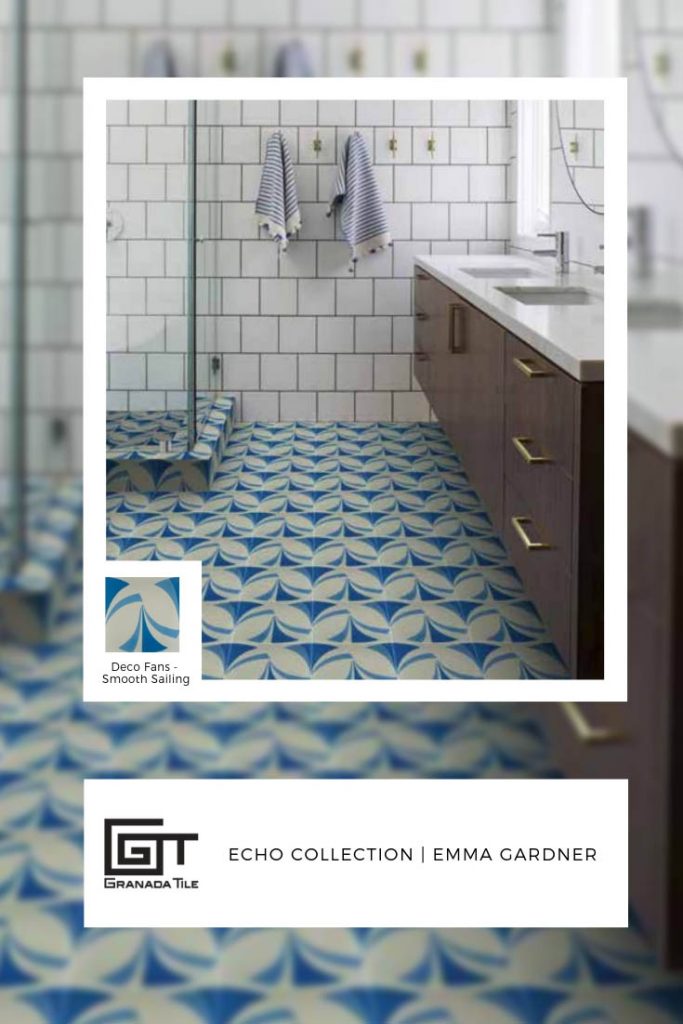
For some interior designers and architects, allowing personality to shine through their designs matters the most. Emma Gardner states, “There is no better vehicle for personality and tone than tiles,” and we could not agree more. With the endless options for encaustic cement tile colors, you can transmit unique details effortlessly.
Tip #2 – Branch out from popular tones
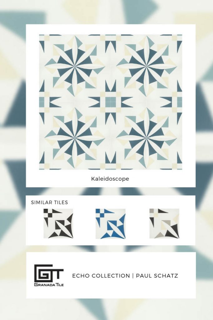
Creating countless colors is easy due to the process utilized during the tile’s creation, and interior designer Paul Schatz gives insight into how he selects color combinations with the design tool. He appeases clients asking to branch out of the popular tones (the traditional tans, grays, and whites) by helping them move into the vibrant side of decor with tile.
Schatz’ process gives designers a look into how to create a color palette for tile designs using technology. “First, we view the pattern in one color which is normally black on a white background. Then I like reversing these colors using white on a black background. Then we combine multiple colors in various locations on the pattern as the form of the pattern often varies.” By trying the color choices against the pattern, he can select fabrics and home decor materials which compliments the tile. Schatz finds it “important to select a group of sophisticated fabrics in pleasant color groups and see how tile patterns coordinate” during the design process, which aids in creating an overall room’s color palette.
Tip #3 – Think long-term
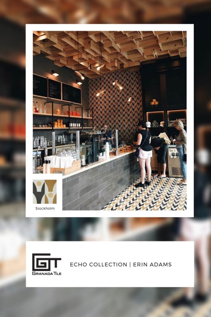
Color palettes are about more than simply finding some tones you enjoy and slapping them into an open space. Tile design is reflective of what’s in vogue, what suits the client, and what will be considered timeless rather than dated. Erin Adams pulls her inspiration from history books on color and goes off of what would work long-term. She states “I always imagine when creating palettes, would I be able to live with color combo in my kitchen? If so then it is usually a winner.” When creating a color palette for your tile design, it’s important to keep in mind the room it will be used in. Loving a color for itself might not mean it’s the ideal fit for your space and thinking through the long-term use will aid in creating a palette which is built to last.
Creating a color palette for your tile designs has never been easier. Read our blog, “The Ultimate Guide to Customizing Cement Tile Patterns,” to get started. If you have any questions you can always call us at (213) 788-4238 or sales@GranadaTile.com to find out more.




[…] a staple in the interior designer’s toolbox. Encaustic tiles are able to be made in nearly any color combination, and the Moroccan style makes them the top choice for many […]