
Choosing the tile color for any particular space in your home can seem like a daunting task. There are multiple factors that influence how a space looks and feels, and color is a big one. So how do you choose the right color and make the most of your tile?
Following are some simple guidelines for choosing a color palette. Understanding the personality profiles behind different colors can help you make your decision. Choosing a colored tile is different from choosing a wall paint because you obviously can’t just brush over it. Take some time to think about how you want your space to look and feel before you settle on the hues of your colored tile.
Tips for Choosing a Tile Color Scheme
- Consider the size of the room
- Lighter colors and soft neutrals brighten up a space, and bold, bright colors can work really well in small spaces.
- Use the color wheel for inspiration
- The color wheel, which includes primary colors, secondary colors and tertiary colors, can give you a sense of what colors look good together and which combinations create nice contrast. Colors that blend well together sit next to each other, while colors that highlight each other and provide contrast sit directly across from each other. Depending on how you use the color wheel, you can create a color palette that is vivid and dynamic, or soothing and easy on the eyes. Check out how Better Homes & Gardens utilizes the color wheel to help you create your perfect color scheme.
- Let the color shine
- Bold color combinations and tile patterns work especially well in smaller spaces but to avoid overwhelming them, add just enough to create a unique design statement.
- Use the 60, 30, 10 rule
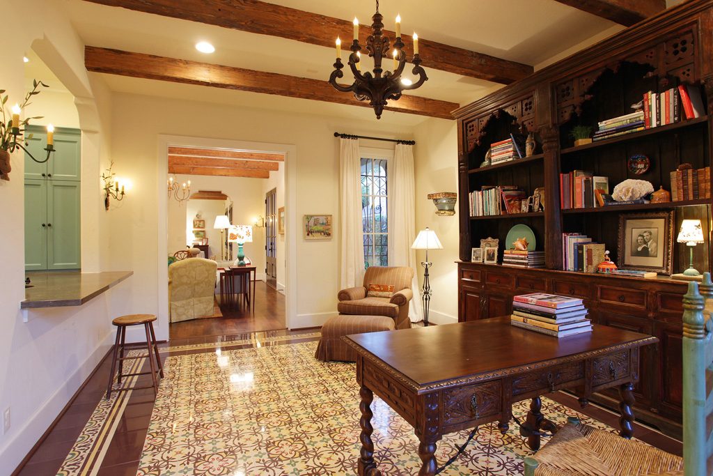
- Divide the colors you like based on the components of a room. The dominant color should make up 60%, the secondary color about 30%, and the accent color about 10% of a room. For example, when looking at the living room on page 9 of this slideshow, the dominant cream color is on the walls, the secondary color is the navy blue furniture while the accent colors are found in the accessories, including red, yellow and white alongside natural wood accents.
- Follow the Rule of 3
- A combination of three colors is enough to create interest without being too overwhelming. For example, sunny yellow, navy blue and grassy green all work well together to create a room that is cheerful, bright and classically preppy. A bedroom with a palette of purple-gray, light gray and white will appear serene and relaxing, and it will always look good.
Palette Persona: Colors and Their Meanings
Warm colors, like red, yellow and orange, give inspiration to fall leaves, sunsets and sunrises. They are energizing, passionate and positive. These bright, bold colors make a statement and are best for formal rooms.
Cool colors, including blue, purple and green, are often more subdued than warm colors. They are calming and relaxing in nature. Cool colors can be reminders of night time, of water and of nature. They are most often recommended for more informal spaces and bedrooms.
- Red
- Red is associated with fire, strength, power and passion. As an incredibly bold color, red makes for a striking hue in formal areas, like dining rooms. When used as an accent color in tile, red can add a pop to avoid flat color pairings.
- Orange
- Orange is known to be energizing and symbolizes creativity. Orange commands attention and is less overpowering than red. It creates a party-like atmosphere and represents change and movement.
- Yellow
- Yellow is the brightest and most energizing of the warm colors and represents sunshine and happiness. Yellow is also associated with hope and cheerfulness.
- Pink
- Representing warmth, love and tranquility, pink is often considered a feminine color. Pink can, however, be versatile. Softer pinks are calming, and pink with subtle hints of gray or black tone it down and make it more of a neutral.
- Green
- The color green can swing cool or warm. Green most often represents nature and evokes feelings of being outdoors and calmness. Being at the center of the color spectrum, it represents balance.
- Blue
- Blue is one of the most calming and soothing colors that can promote rest and peace of mind. Shades of blue are often used in bedrooms to inspire relaxation and serenity.
- Purple
- Purple is a noble color, representing royalty, wealth, wisdom, prosperity, and sophistication. Light shades of purple like lilac and lavender are soothing, calming, and more romantic, while deeper shades of purple are rich and enveloping.
- Black
- Black is associated with authority, power, strength, and sophistication. When used in design, black anchors the room and often accents the other colors used.
- Gray
- Gray is the most popular neutral right now. It is often chosen for its sophisticated and soothing properties that aren’t too stark and bold. Gray can also be gloomy and depressing and should be elevated with brighter neutrals like white and cream or used in combination with a different set of colors.
- White
- White represents cleanliness and can make just about any room seem brighter, lighter, and more open.
Our Favorite Color Combos and Trend-Setting Pairs
The color wheel provides great insight for choosing color pairings, depending on whether you want a soothing palette or high contrast.
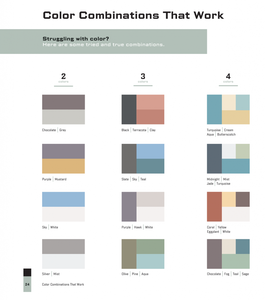
Analogous color schemes include one main color and one or two colors directly next to it on the color wheel. This creates a low contrast color scheme and a softer appearance. Here are some examples of an analogous color scheme: Olive green, pine green and aqua blue; midnight blue, soft misty blue, jade green and turquoise.
Monochromatic color schemes involve one main color and various shades of that same hue. It lacks color contrast and often looks clean and polished. Examples of monochromatic color schemes include: Cream, sunny yellow, butterscotch yellow, mustard yellow, caramel and tan; a range of blues in aqua, turquoise, sky, true blue, teal and midnight; shades of brown in latte, taupe, coffee and espresso.
Complementary color schemes are the most contrasting because they involve two or more colors that sit directly across from each other on the color wheel. They are opposites, like red and green, orange and blue, and purple and yellow. Refined complementary color palettes include turquoise, cream, aqua and butterscotch yellow; coral, yellow, eggplant purple and white; and a unique scheme of black, terracotta and clay in shades of ruddy red.
Here are some tried-and-true color combinations that have remained stylish over the years:
- Shades of blue
- Yellow and white
- Red-orange and blue-green (coral and teal)
- Navy blue and white or cream
- Pink and garden green
- Purple and soft yellow or cream
- Bright red and green
- Blush pink and emerald green
- Orange/yellow and sky blue
- Yellow and shades of green
- Green and shades of blue
- Shades of pink
- Pink and gray
- Yellow and gray
And let’s not forget about the neutrals:
- Black and white
- White and gray
- Black and gray
Granada Tile’s newest color combinations that are made for tiles and look stunning in virtually any space are:
- Shades of pinks and reds in rose, copper, terracotta, clay, coral and cordoba
- Shades of golds and yellows in fog, cream, yellow, butterscotch, mustard, caramel and tan
- Shades of green in river, jade, sage, pine and olive
- Purple, chocolate and eggplant
- A range of shades from white to black, including mist, hawk, grey, pebble, silver and slate
Here are some suggested combinations from Granada Tile’s recent catalog:
Other favorite color combinations from Granada that involve more contrast and complementary colors include:
- White, chocolate, light grayish brown in pebble, and terracotta
- Teal, midnight blue, light grayish white, and a misty soft blue
- White, medium gray in hawk, dark gray in silver, and aqua
- Espresso brown, orange-red, creamy white, and warm light brown in latte
- White, butterscotch yellow, silver gray, and a soft buttery yellow
- Blue, pine green, sage green, and sky blue
- Coffee, tan, warm reddish brown clay, and terracotta
- Black, rose pink, taupe, and a grayish purple
- Light creamy gray in fog, light gray-blue in dawn, sky blue, and sage green
- Medium gray, buttery yellow, white, and a grayish sage green in river
Each of these color combinations can be found at the back of our new catalog.
For more tips and tricks for designing your perfect space and choosing the right color tile, get in touch with our team of tile experts today at Granada Tile.


